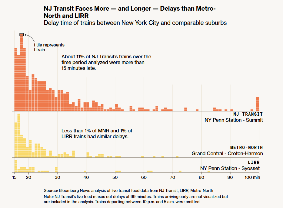
| Today we’re bringing you a special edition of MapLab from Aaron Gordon, our colleague on the data team. Last summer I wrote about a stalled New Jersey Transit commuter train that trapped passengers inside a tunnel for three hours during a heat wave with no air conditioning. The overwhelming reader reaction in my inbox was that I had failed to capture the full extent to which service disruptions on the aging system infuriate riders. As a data reporter focusing on transportation, I took this as a challenge. The New York area has two other commuter railroads — Metro-North and the Long Island Rail Road — that largely do the same job as NJ Transit: funneling white-collar workers from leafy suburbs to Manhattan. How does NJ Transit compare? Unfortunately, NJ Transit doesn’t make that comparison easy. The only delay metric it publicly reports is its on-time performance, or the number of trains that arrive at the last stop within six minutes of schedule. It is an industry standard metric and generally a bare minimum, reporting-wise. It doesn’t distinguish a 7-minute delay from a 70-minute one, which to a commuter, is a world of difference. So we on the data team decided measure the system’s performance ourselves. NJ Transit, like many transit agencies, publishes real-time data feeds of train locations for use by navigation apps like Google Maps or Transit. Working with my colleague Surya Mattu, we collected these feeds for all three railroads for May through July and processed the data. This gave us unprecedented detail into how NJ Transit stacks up. The answer is: not good. NJ Transit has roughly six times the number of significant delays and cancellations as its peers. 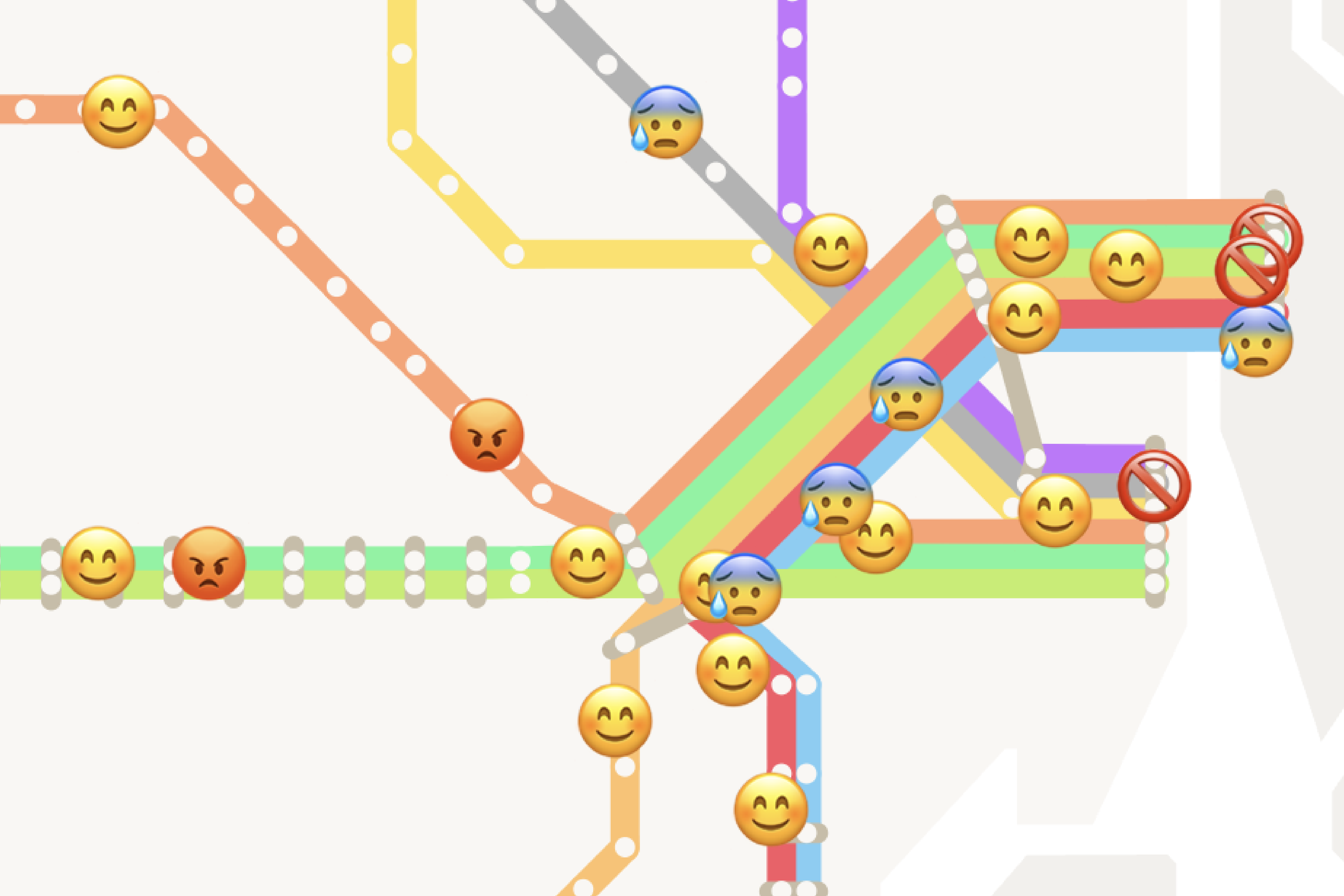 Our animation maps a particularly bad evening commute in June, using emojis to represent varying severities of service disruption. To illustrate how bad this can actually get, we wanted to animate a disastrous commute on a map. That’s where Marie Patino, my colleague on the graphics team, came in. A good transit map for animation purposes is different from a good transit map in general. So Marie built her own NJ Transit map, heavily inspired by official maps and various diagrams of the network (the nicest one she found being this one). You can read our analysis and see the final product here. Why is one railroad so much worse than the others? The short answer is: money. Metro-North and LIRR have received generous funding from New York, while NJ Transit has been starved by its state legislature. This is particularly important now, given that a lot of the financial support for transit comes from the federal government. The Trump administration is one of the most hostile towards public transit in modern history. Commuters may not immediately feel the impact of Trump’s funding cuts, but as NJ Transit shows, the service disruptions will become hard to ignore once maintenance issues start piling up. How Hurricanes, Fires and Floods Put Drugs and Medical Supplies at Risk
A new study shows that a large chunk of US drug factories are in disaster-prone areas. From the Archive: The Commuting Principle That Shaped Urban History
From ancient Rome to modern Atlanta, the shape of cities has been defined by the technologies that allow commuters to get to work in about 30 minutes. African Union Backs Campaign to Adopt More Realistic World Map
The African Union has joined the call to adopt a world map that more accurately reflects the continent's relative size. |