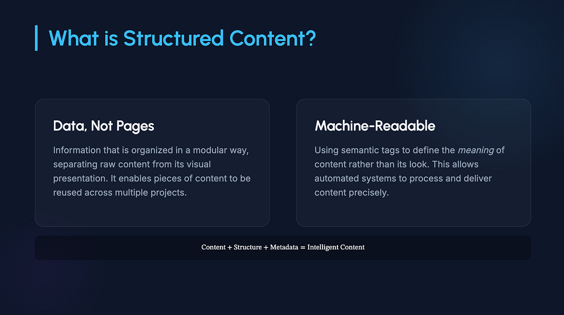
I asked an AI tool to create a slide deck introducing the idea of tech writers becoming “context designers.” It took only a few seconds to produce something that looked completely presentable.
There was an agenda, several bullet-heavy slides, a comparison table, a few icons, and the familiar blue background that seems to accompany many enterprise software slide decks.
There wasn’t anything obviously wrong with the slides it generated. If someone had shown it during a conference presentation, I doubt anyone in the audience would’ve complained.
At the same time, I couldn’t point to a single slide that helped me make sense of the topic. The deck looked like a presentation because the AI tool had learned what presentations (slide decks it was trained on) typically look like. That isn’t the same thing as understanding how presentations are designed and what techniques are needed in order to communicate with slides effectively.
Why Do AI-Generated Slides Feel So Familiar?
This question set me off on a hunt for guidance from an old school resource. My bookshelf, which housed several works from two communication design influencers.
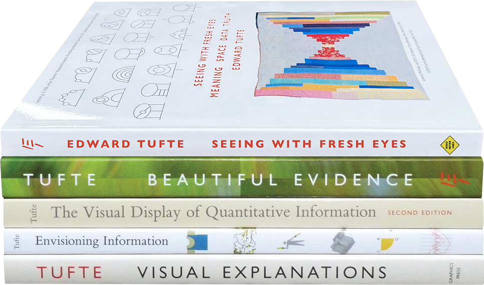
Edward Tufte hardly needs an introduction for many readers of The Content Wrangler. But for the uninformed, he’s Professor Emeritus in Political Science, Computer Science & Statistics at Yale University. His books, especially The Visual Display of Quantitative Information, Envisioning Information, and Beautiful Evidence, shaped the way generations of technical illustrators, information designers, and technical communicators think about charts, diagrams, comparison, and evidence.
Essential reading for tech writers from Edward Tufte.
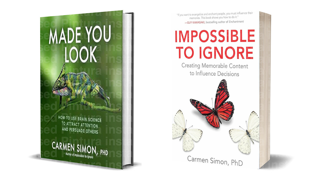
Two neuroscience-backed books from Carmen Simon, PhD that can help you ensure people see, remember, and understand your message.
To be clear, neither of these experts’ books contained advice about AI presentation tools. Instead, Tufte asks whether the presentation makes important relationships visible. Simon asks whether the presentation directs attention to what matters.
Those ideas gave me a different way to look at the slide deck AI produced. The deck generated resembled thousands of presentations I'd seen before, but I’m fairly sure the deck hadn’t been designed to help audiences understand any of the ideas contained in it.
AI-powered presentation generators have learned the patterns found in millions of previously published slide decks. That doesn’t mean they’ve learned which presentation choices actually help people understand information. This observation became more obvious after a small experiment.
What Happens When AI Tries To Communicate Ideas?
Simon uses a comparative visualization (like an elephant standing next to a mouse) to communicate an enormous difference in size. It’s a simple example because everyone already understands the comparison before the speaker explains it.